


Table of contents
- What You’re Building
- Prerequisites
- Setting Things Up
- Building a Responsive Hamburger Menu in React
- Step 1: Create a Parent Folder
- Step 2: Create a Subfolder
- Step 3: Create Components
- Step 4: Render the NavBar to the Browser
- Step 5: Style the Navigation Menu
- Step 6: Add a Mobile Navigation Component
- Step 7: Render the MobileNavigation Component
- Step 8: Fix the Duplicate Navigation Menus
- Step 9: Make the Navigation Menu Responsive
- Step 10: Add a Hamburger Icon
- Step 11: Position the Hamburger Icon
- Step 12: Make the Hamburger Icon Functional
- Step 13: Add a "Close" Icon to MobileNavigation
- Step 14: Style the Mobile Navigation
- Step 15: Tidying Up
- Conclusion
Navigation menus are often one of the first components developers create during web development, primarily because they enhance the user's understanding of a website's structure and content. In this tutorial, you'll learn how to build a responsive navigation or hamburger menu using React. To fully benefit from this tutorial, it's helpful to already have experience creating responsive navigation menus with JavaScript, HTML, and CSS.
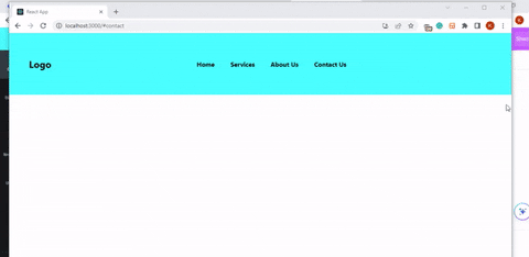
What You’re Building
Here’s a glimpse of what you’ll have by the end of this tutorial:
You can customize the style and content of the navigation menu to suit your needs, but the core functionality will remain the same.
Prerequisites
To follow along, you should have a basic understanding of the following:
Props and state in React
CSS media queries
How to use the terminal
In addition to those, you need a code editor and a web browser. This tutorial uses Visual Studi Code and Google Chrome, but any code editor and web browser will work.
Setting Things Up
Follow the steps in this section to set up the project's environment. If you have already created a React app, skip the first three steps below.
Install NodeJS
Open the terminal in your code editor and run the following command to check if NodeJS is installed on your device:
node -vIf a version number is returned, NodeJS is correctly installed. Otherwise, download and install NodeJS before continuing.
Create a React App
Using the terminal, navigate to the directory where you want to locate your app, then run the following command to create a new React application.
 npx create-react-app myapp

 // myapp above is the name of your project
Open the Project Folder
Once your app has been successfully created, open it by running:
cd myappStart the App
Run the following command to start your new or existing React app:
npm startEnsure you are inside your app’s folder in the terminal before running the command above.
Install Dependencies
For this project, you need the React Icons package. It allows you to use custom-made icons in your project. To install React Icons, run the following command:
npm install react-iconsClear Unnecessary Files
Create React App installs some default files and content. To remove the unnecessary ones, do the following:
Delete the
logo.svgfile.In the
srcfolder, locate theApp.jsandApp.cssfiles and delete their contents.
In the next section, you will start building the hamburger menu. Be sure to follow each step in order, as skipping any steps may lead to errors.
Building a Responsive Hamburger Menu in React
This section will guide you through building a fully responsive hamburger menu. Before proceeding, note that in React, the term component refers to a file with specific functionality. Consequently, the terms file and component will be used interchangeably in this section.
Step 1: Create a Parent Folder
You need a parent folder to hold all the components of your project, not just the navigation menu. To create one, follow these steps:
Locate the
srcfolder in the file tree.Create a new folder within the
srcfolder and name itComponents.
Step 2: Create a Subfolder
Within the Components folder, create a new subfolder named NavBar. This folder will contain all files related to your navigation menu.
Step 3: Create Components
Within the NavBar folder, create the following files:
NavBar.css
Create a file named
NavBar.cssthat will contain the style rules for the navigation menu.NavLinks.js
Create a file named
NavLinks.jsand import theNavBar.cssfile into it. For now, this component will be a stateless function component that returns a list of menu items.//NavLinks.js import './NavBar.css'; const NavLinks = () =>{ return( <nav className="NavLinks"> <ul> <li> <a href="/">Home</a> </li> <li> <a href="/#services">Services</a> </li> <li> <a href="/#about">About Us</a> </li> <li> <a href="/#contact">Contact Us</a> </li> </ul> </nav> ) } export default NavLinks;DesktopNavigation.js
Create a new file named
DesktopNavigation.js. This file will also be a stateless function component with the following content://DesktopNavigation.js import NavLinks from "./NavLinks"; import './NavBar.css'; const DesktopNavigation = () =>{ return() } export default DesktopNavigation; // Note that NavBar.css and NavLinks.js are imported hereIn the return block of this component, add an element to render the text “Logo” to the browser. This will serve as the app’s logo. If you have an image, use the
<img>tag instead of the<h2>tag used below:<h2 className="logo">Logo</h2>Render the
NavLinkscomponent you imported, then wrap everything in a<nav>tag with a class name ofDesktopNavigation. The final code for theDesktopNavigationcomponent should look like this://DesktopNavigation.js import NavLinks from "./NavLinks"; import './NavBar.css'; const DesktopNavigation = () =>{ return( <nav className="DesktopNavigation"> <h2 className="logo">Logo</h2> <NavLinks /> </nav> ) } export default DesktopNavigation;NavBar.js
Create a new file named
NavBar.js, then import and render theDesktopNavigationcomponent within it as follows://NavBar.js const NavBar = () => { return() } export default NavBar; //leave the return block empty for now
Step 4: Render the NavBar to the Browser
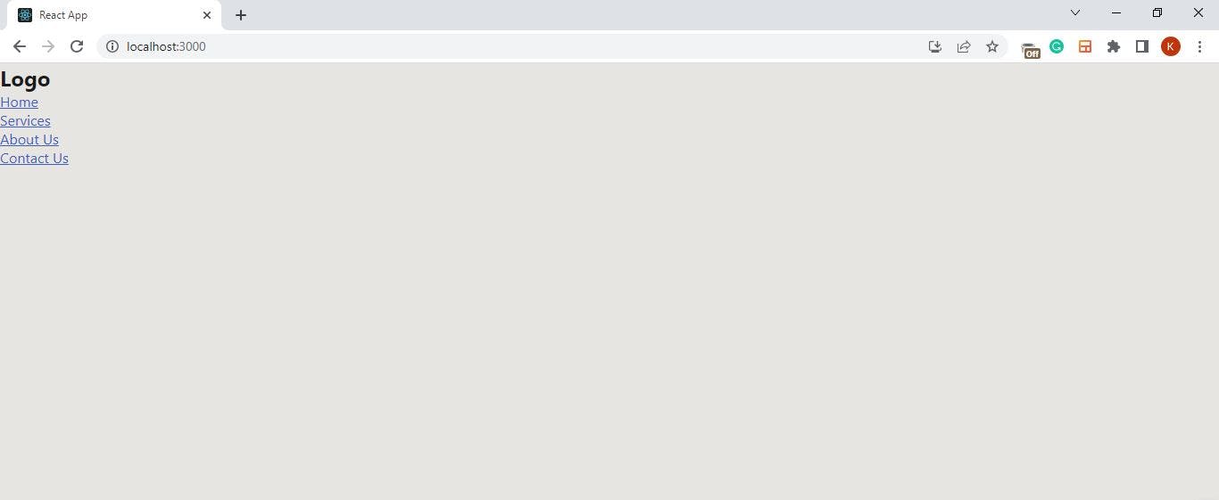
In the App.js file, import and render the NavBar component as follows:
//App.js

import NavBar from './../Components/NavBar/NavBar';

function App() {
  return (
    <NavBar />
  );
}

export default App;

//The import statement above is different from other imports
//you have done so far because App.js lives outside
//the NavBar container you created for this navigation menu.
An unstyled navigation menu should now be visible in your browser, as shown below:
Step 5: Style the Navigation Menu
Before applying style rules to the navigation menu, locate the index.css file in the file tree and paste the following code into it:
/*Index.css*/

*{
  padding: 0;
  margin: 0;
  box-sizing: border-box;
}

/* This ensures that default browser styling doesn't affect your app
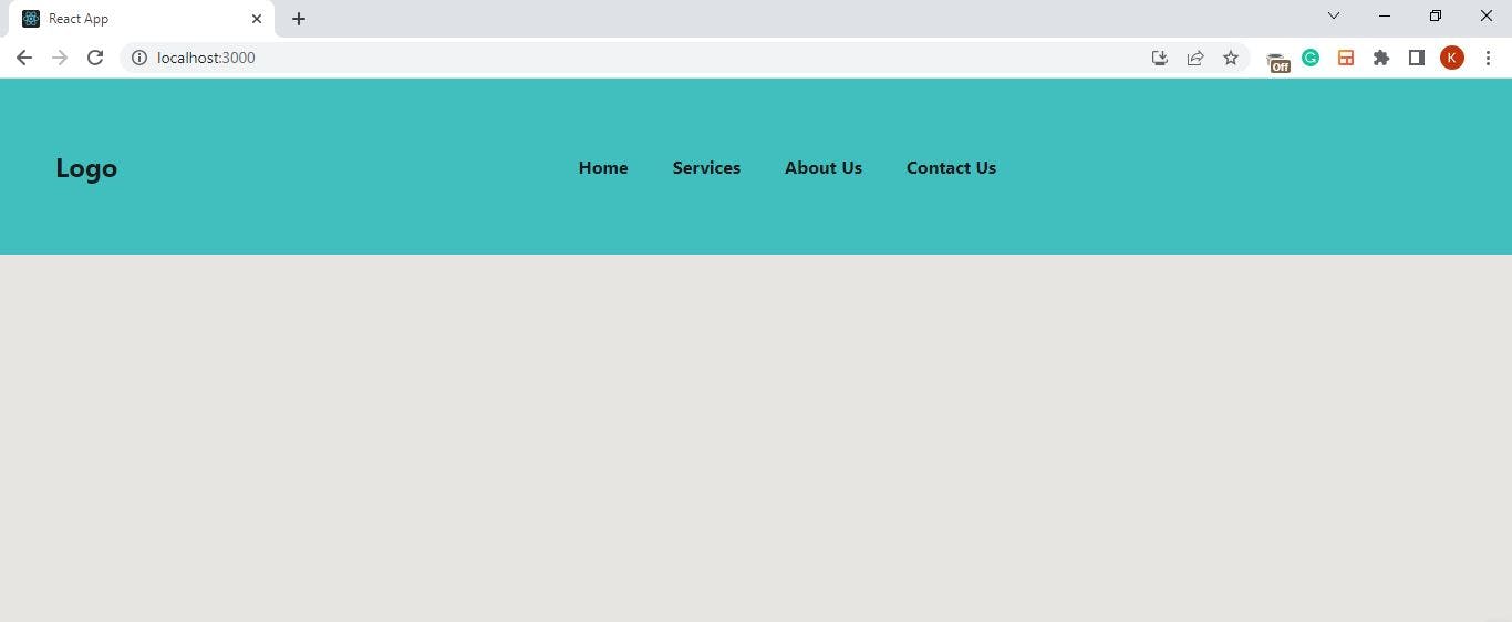
Then, copy the code below and paste it into your NavBar.css file, or apply your own custom styling.
/*NavBar.css*/

nav{
    display: flex;
    align-items: center;
    justify-content: space-evenly;
    background: aqua;
    padding: 30px 50px 30px 50px;
}

.NavLinks{
    height: 15vh;
}

nav ul{
    display: flex;
    flex-direction: row;
    justify-content: space-evenly;
}

nav ul li{
    list-style-type: none;
    display: inline-block;
    padding: 10px 20px;
}

nav ul li a{
    text-decoration: none;
    font-weight: bold;
    color: black;
}

nav ul li a:hover{
    color: white;
    transition: .3s;
}

/*You can style yours differently
Check your browser to ensure that the specified styles have been applied. You should have something close to the image below:
Step 6: Add a Mobile Navigation Component
So far, you’ve created a desktop navigation menu. Now, to accommodate mobile users, follow these steps:
Create a new file named
MobileNavigation.js.Copy the content of
DesktopNavigation.jsand paste it intoMobileNavigation.js.Replace every instance of DesktopNavigation with MobileNavigation in the code you copied.

Step 7: Render the MobileNavigation Component
In the NavBar component, import and render the MobileNavigation component as shown below:
//NavBar.js

import DesktopNavigation from './DesktopNavigation';
import MobileNavigation from './MobileNavigation';

const NavBar = () => {
    return(
        <div>
            <DesktopNavigation />
            <MobileNavigation />
        </div>
    )
}

export default NavBar;
Since MobileNavigation and DesktopNavigation are identical components, you should now see duplicate navigation menus in the browser:
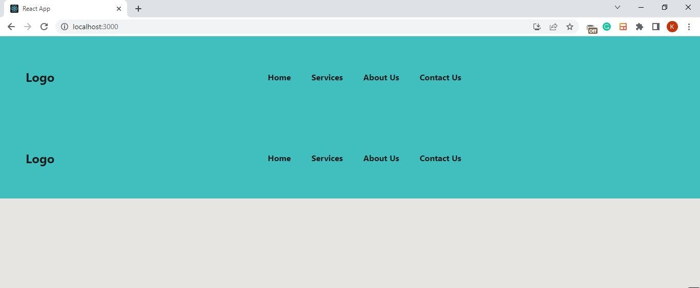
Ideally, you should render only one of DesktopNavigation or MobileNavigation based on the user's screen size, not both at once. You’ll address this issue with CSS in the next step.
Step 8: Fix the Duplicate Navigation Menus
In the NavBar.css file, set the display property to none for the MobileNavigation class:
/*NavBar.css*/

.MobileNavigation{
    display: none;
}

/*This takes the MobileNavigation component away from the browser.
Step 9: Make the Navigation Menu Responsive
Currently, the MobileNavigation component is hidden. You want to ensure it is visible on mobile devices while hiding the DesktopNavigation component. To achieve this, update the NavBar.css file with the following media query:
/*NavBar.css*/

@media (max-width: 768px){

    .DesktopNavigation{
        display: none;
    }

    .MobileNavigation{
        display: flex;
        align-items: center;
        height: 15vh;
        background-color: red;
    }

    .NavLinks{
       background-color: red;
    }
}

/*the height property within this media query should be equal to the height
 of the NavLinks classname
Resize your browser to confirm that the media query is active. You can verify this by checking if the background color changes at the specified breakpoint of 768px.
Step 10: Add a Hamburger Icon
A hamburger icon is a more conventional way to represent a navigation menu on mobile devices. To implement this functionality using the react-icons package you installed earlier, do the following:
Visit the React Icons website.
Search for "menu" in the search bar.
Browse the search results to find a hamburger icon you like.
Click on the icon to copy its name to your clipboard.
Open your
MobileNavigationcomponent and import the icon using the following syntax://MobileNavigation.js import {MdOutlineMenu} from 'react-icons/md' /*Append the first two letters of an icon's name to the end of the import statement. The letters "md" was added to 'react-icons/' because we imported 'MdOutlineMenu'Create a variable named
Hamburgerand embed the imported icon within it. Assign a class name ofHamburgerMenuto the icon, and specify values for itssizeandcoloras follows://MobileNavigation.js const Hamburger = <MdOutlineMenu className="HamburgerMenu" size="30px" color="black"/>Lastly, render the
Hamburgervariable within theMobileNavigationcomponent. Your code should be similar to the following://MobileNavigation.js import NavLinks from "./NavLinks"; import './NavBar.css'; import {MdOutlineMenu} from 'react-icons/md'; const Hamburger = <MdOutlineMenu className="HamburgerMenu" size="30px" color="black"/> const MobileNavigation = () =>{ return( <nav className="MobileNavigation"> <h2 className="logo">Logo</h2> {Hamburger} <NavLinks /> </nav> ) } export default MobileNavigation;
Step 11: Position the Hamburger Icon
You need to position the hamburger icon to the far right of the navigation menu. To achieve this, locate the media query block in NavBar.css and add the following properties to the HamburgerMenu class:
/*index.css*/

.HamburgerMenu{
        position: absolute;
        right: 2%;
        cursor: pointer;
    }

/*This code block should be located within your media query.
You should now see the hamburger icon positioned on the far right of the navigation menu in your browser, as shown below:

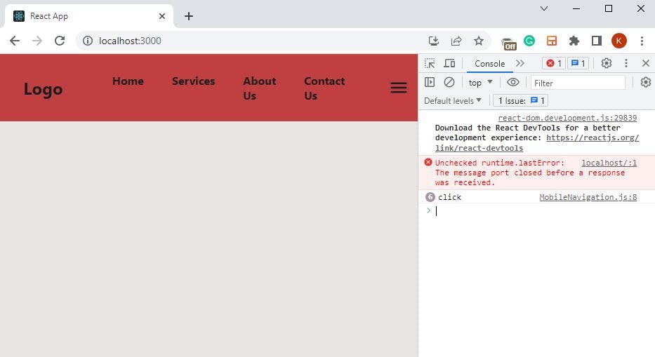
Step 12: Make the Hamburger Icon Functional
To make the hamburger icon functional, you'll need to attach an event listener to it. This event listener will trigger a function each time a user clicks on the icon. For now, you can log "click" to the console:
//MobileNavigation.js

const Hamburger = <MdOutlineMenu className="HamburgerMenu"
           size="30px"
           color="black"
           onClick={() => console.log("click")} />
Confirm that the onClick event is functional by inspecting your browser’s console:
To enable the hamburger icon to toggle the navigation menu on and off when clicked, import the useState hook into your MobileNavigation component as follows:
//MobileNavigation.js

import { useState } from "react";
Next, define a state within the MobileNavigation component:
//MobileNavigation.js

const [click, setClick] = useState(false);

//the state above is initialized to "false"
Within the onClick event, call setClick and pass !click to it as an argument. This will toggle the state’s value each time the user clicks on the hamburger icon:
//MobileNavigation.js

const Hamburger = <MdOutlineMenu className="HamburgerMenu"
           size="30px"
           color="black"
           onClick={() => setclick(!click)} />

/*
1. The console.log you had before has been replaced with the
state setter function (i.e setClick)

2. The exclamation mark in setClick's argument above is
responsible for toggling the state's value between true/false.
Next, specify a condition that determines what to display based on the state’s value. You want React to display the NavLinks component if the state’s value is true; otherwise, nothing should be displayed. Here’s how to set that up:
//MobileNavigation.js

<nav className="MobileNavigation">
    <h2 className="logo">Logo</h2>
    {Hamburger}
    {click && <NavLinks />} // pay attention to this line
</nav>
For now, your MobileNavigation component should look like this:
At this point, your hamburger icon should toggle the navigation menu on and off when clicked.
Step 13: Add a "Close" Icon to MobileNavigation
In mobile view, users need an icon to click on to hide the menu items displayed by the hamburger icon. To implement this, follow these steps:
Revisit the react-icons website.
Search for the term "close."
In the search results, find your preferred icon and click on it to copy its name to your clipboard.
Import the icon into your
MobileNavigationcomponent, just as you did with the hamburger icon://MobileNavigation.js import {MdClose} from 'react-icons/md'; //append 'md' to 'react-icons'Below the
Hamburgervariable, create a new variable namedClose.Copy the content of the
Hamburgervariable and paste it into theClosevariable.Edit the code by replacing MdOutlineMenu with MdClose. Your code should look like this:
 //MobileNavigation.js

 const Close = <MdClose className="HamburgerMenu"
             size="30px" color="black"
            onClick={() => setclick(!click)} />
In the return block, use a ternary operator to conditionally render either the Hamburger or Close icon based on the state:
 //MobileNavigation.js

 return(
         <nav className="MobileNavigation">
              <h2 className="logo">Logo</h2>
              { click ? Close : Hamburger}
              {click && <NavLinks }/>}
         </nav>
     )
For clarity, your MobileNavigation component should look like this:
//MobileNavigation.js

import NavLinks from "./NavLinks";
import './NavBar.css';
import {MdOutlineMenu} from 'react-icons/md'
import { useState } from "react";
import {MdClose} from 'react-icons/md';


const MobileNavigation = () =>{
    const [click, setclick] = useState(false);

    const Hamburger = <MdOutlineMenu className="HamburgerMenu"
           size="30px" color="black"
           onClick={() => setclick(!click)} />

    const Close = <MdClose className="HamburgerMenu"
            size="30px" color="black"
           onClick={() => setclick(!click)} />

    return(
        <nav className="MobileNavigation">
             <h2 className="logo">Logo</h2>
             { click ? Close : Hamburger}
             {click && <NavLinks />}
        </nav>
    )
}

export default MobileNavigation;
Step 14: Style the Mobile Navigation
You now have a functional navigation menu, but it doesn't behave like the typical menu you might expect. To fix that, go to the media query in your NavBar.css file and do the following:
Remove the
background-colorproperty you previously assigned to theMobileNavigationandNavLinksclass names.Assign the following properties to the
ulelement:.NavLinks ul{ display: flex; flex-direction: column; justify-content: space-evenly; position: absolute; border-top: 3px solid orange; top: 15vh; right: 0; height: 50vh; width: 100%; background:blue; }Ensure that the
topvalue in the CSS style above matches theheightvalue you assigned to theNavLinksclass name in Step 5. This alignment ensures that your mobile menu renders just below the navigation bar. See it in action below: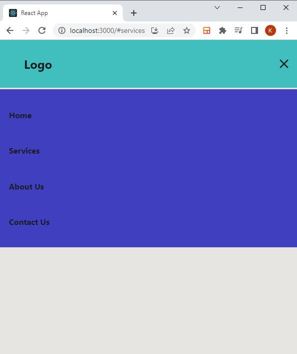
Step 15: Tidying Up
The project is almost complete, but there's one issue: the navigation menu doesn't close when you select any of its items. To fix that, follow these steps:
In the
MobileNavigationcomponent, within theClosevariable, define a function calledcloseMenu. This function will set the state value tofalsewhen called:const closeMenu = () => setclick(false); /* The mobile navigation menu will go away when the state’s value is false.Since the mobile navigation menu will disappear when the state’s value is
false, you need a way to trigger thecloseMenufunction when a menu item is selected. You can achieve this by passing props to theNavLinkscomponent as follows:{click && <NavLinks isClicked={true} closeMenu={closeMenu}/>}Go to the NavLinks component and receive the props:
 const NavLinks = ({isClicked, closeMenu}) => {
     return (
         <nav className="NavLinks">
         <nav/>
     )
Then, attach an
onClickevent to each of the list items, passing in both theisClickedandcloseMenuprops. Your final code should look like this:
If you’ve made it this far, congratulations on successfully building a fully responsive hamburger menu in React!

Conclusion
In this tutorial, you learned how to build a responsive hamburger menu using React. While this approach is one of many ways to create navigation menus, it's a solid starting point for beginners. If you're already familiar with building responsive menus using plain JavaScript, comparing that knowledge with this React-based approach can deepen your understanding of both techniques.